FLUX.1 이미지 변환 생성기
FLUX.1 이미지 변환 생성기를 사용하여 이미지를 변환하세요. 120억 매개변수 변환기를 사용하여 이 도구는 상세한 텍스트 프롬프트를 기반으로 놀라운 수정 및 향상을 가능하게 합니다.
생성된 이미지

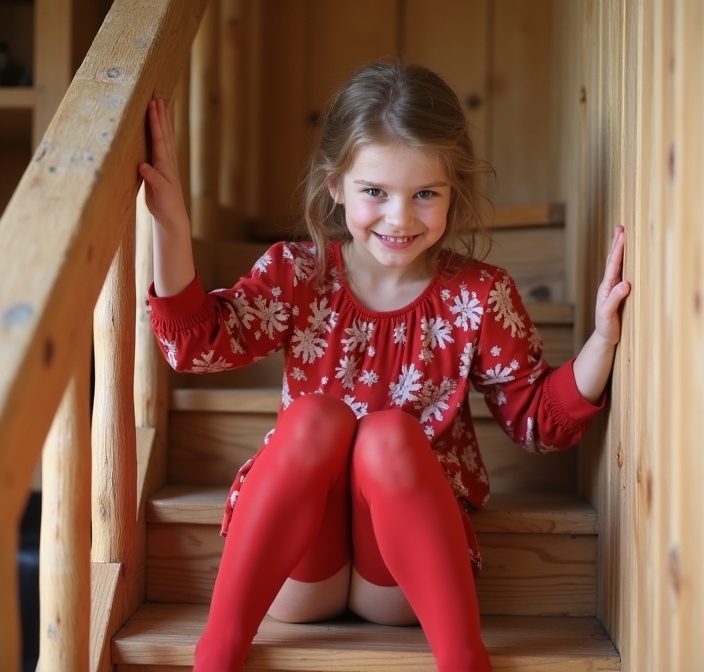
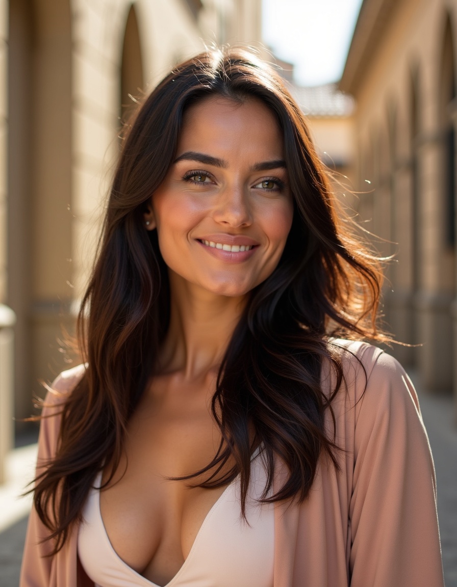
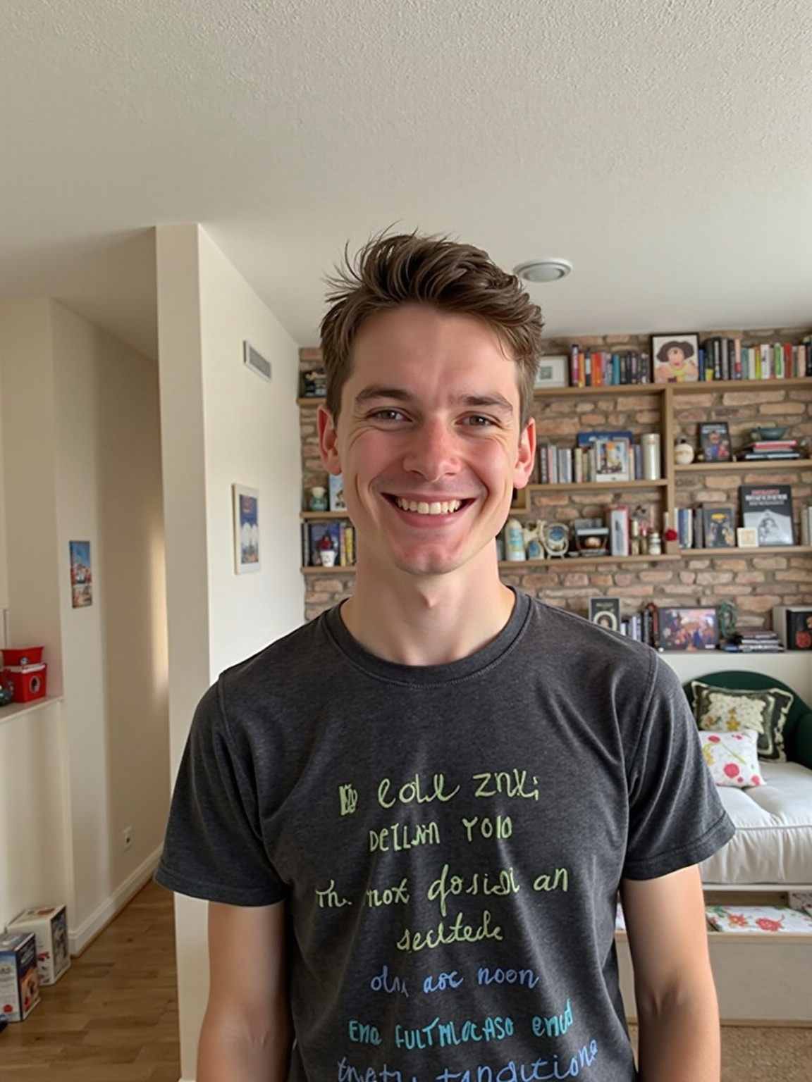
Make this photo in a better quality and make the humanoid on the photo smile a bit. All the rest don't change: colors, light and etc

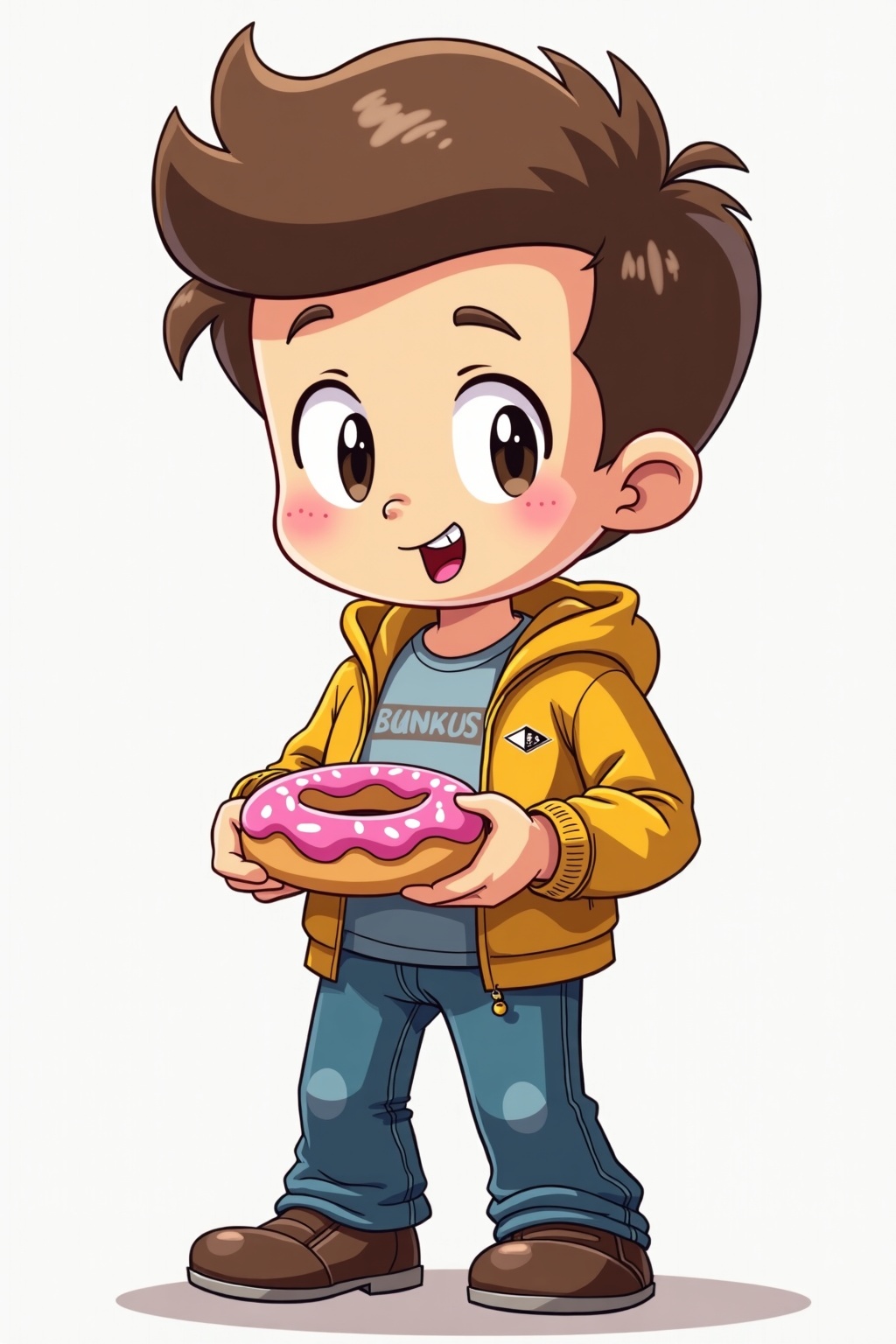
Design Guidelines for Kid-Friendly Learning App Use this guide to ensure every visual element — from characters to icons to backgrounds — is cohesive, child-friendly, and ready for screen-based animation. These principles must be followed for all illustrations, UI assets, and animations. 1. Clean Flat Vector Aesthetic Do this: • Use solid, flat colors only — no gradients, no shadows, no textures. • No outlines. Shapes should be clean and readable without strokes. • All shapes must be soft and rounded. No sharp corners or aggressive angles. Purpose: • Creates a friendly, safe, and screen-friendly appearance. • Ensures clarity and consistency on all screen sizes. 2. Color System Primary Colors (Main UI Elements, Highlights) 1. Fresh Green – RGB: (2, 157, 103) – Hex: #029d67 2. Sky Blue – RGB: (119, 188, 246) – Hex: #77bcf6 3. Sunshine Yellow – RGB: (250, 221, 62) – Hex: #fadd3e 4. Blush Pink – RGB: (246, 121, 122) – Hex: #f6797a 5. Peach Orange – RGB: (254, 206, 138) – Hex: #fece8a Accent Colors (Icons, Small UI Highlights) 6. Bubblegum Pink – RGB: (250, 137, 179) – Hex: #fa89b3 7. Leaf Green – RGB: (94, 204, 71) – Hex: #5ecc47 8. Turquoise – RGB: (63, 179, 236) – Hex: #3fb3ec 9. Tangerine – RGB: (255, 145, 66) – Hex: #ff9142 10. Citrus Lime – RGB: (143, 202, 63) – Hex: #8fca3f 11. Coral Red – RGB: (204, 55, 59) – Hex: #cc373b 12. Pumpkin Orange – RGB: (233, 107, 28) – Hex: #e96b1c 13. Electric Purple – RGB: (97, 62, 232) – Hex: #613ee8 14. Berry Purple – RGB: (210, 50, 190) – Hex: #d232be 15. Seafoam Green – RGB: (34, 181, 115) – Hex: #22b573 16. Flamingo Pink – RGB: (255, 113, 206) – Hex: #ff71ce Neutral / Background Color 17. Pure White – RGB: (255, 255, 255) – Hex: #ffffff 18. Charcoal Black – RGB: (0, 0, 0) – Hex: #000000 19. Cool Gray – RGB: (246, 246, 246) – Hex: #f6f6f6 20. Soft Lavender – RGB: (240, 173, 234) – Hex: #f0adea Structural / Environment Colors (Houses, Mountains, Natural Shapes) 21. Brick Red – RGB: (204, 55, 59) – Hex: #cc373b 22. Earth Brown – RGB: (140, 101, 46) – Hex: #8c652e 23. Royal Blue – RGB: (63, 72, 204) – Hex: #3f48cc 24. Eggplant Purple – RGB: (118, 66, 138) – Hex: #76428a 25. Lemon Cream – RGB: (255, 255, 128) – Hex: #ffff80 Rules: • Colors must be bright and high-saturation. • Ensure strong contrast between foreground and background for accessibility. • Do not use gradients, shadows, or lighting effects. • Use layering to imply depth — not realism. 3. Emotionally Expressive Characters Character Style: • Use chibi proportions: Big heads, small bodies. • Simplify anatomy: No fingers, necks, or detailed joints. • Faces must show clear, exaggerated emotions using: ◦ Wide eyes ◦ Thick eyebrows ◦ Open mouths Design with Personality: • Characters should have distinct moods: ◦ e.g., Character 1 always looks bored or skeptical. ◦ Character 2 might always look excited or curious. Consistency: • Maintain a unique silhouette for each character. • Stick to flat color blocks and geometric forms. 4. Geometric Design Rules Use geometric primitives: • Circles: Heads, eyes, cheeks, hands • Rounded rectangles: Limbs, torsos • Triangles (simplified): Hair spikes, ears, tails Layout rules: • Use centered symmetry for balance and harmony. • Keep designs pixel-perfect — optimized for mobile and tablet. 5. Modular & Animation-Ready Build assets for reuse: • Design facial features (eyes, mouths, brows) on separate layers. • Keep limbs, accessories, and props modular. • Build characters with rig-friendly layering (for use in Lottie or After Effects). UI Integration: • Every illustration must work within screen layouts (buttons, menus, instructional cards). • Avoid overly wide or tall characters that don’t fit standard containers. 6. Educational Reinforcement through Visuals Design with purpose: • Illustrations must clarify language concepts. ◦ e.g., A pig eating an apple for the sentence “The pig eats an apple.” • Props like books, food, and flags must be instantly recognizable, using the same flat vector style. Icons: • Follow the same color and shape rules. • Keep icons simple and functional — never more than 2–3 elements. Do NOT Use Element Reason Gradients or shadows Breaks minimalist, child-friendly look Thin outlines or sketch lines Reduces clarity on screens Realistic textures or proportions Not engaging or necessary for learning Overly complex characters Harder to animate and recognize Recommended Tools • Illustration: Inkscape Summary – Follow These Rules Every Time Design Element Rule Form Flat, soft-rounded, geometric Color Bright, bold, no gradients Characters Chibi-style, expressive, simplified Function Modular, animation-ready, screen-first Mood Cheerful, supportive, child-safe Always ask yourself: “Is this fun, readable, and clear for a 5-year-old?” If not — simplify more. The design must focus on large, inviting, easily tappable elements. Users have less precise motor control, so visual clarity, big targets, and playful proportions are essential. Here’s a tailored guideline based on tablets (iPads and Android), accounting for common screen sizes (7″ to 13″) and PPI (150–326): Object Size Guidelines for Kids Learning Apps (Tablet-Specific) UI/Game Element Suggested Size (dp) Notes / Justification Main Character 120–160 dp Friendly, big enough to feel alive and visible in story scenes Tap Targets (e.g. letters, buttons, animals) ≥72 dp (ideal: 96–128 dp) Google recommends 48 dp minimum; for kids, 72+ dp is much safer Doors / Slide Entrances 150–200 dp height Symbolically large, triggers curiosity; sized for touch and animation Tiles (matching cards, grid) 96–128 dp square Easy tap zones for games like drag-drop, matching Coins / Stars / Icons 64–96 dp Slightly exaggerated visual feedback, avoids eye strain HUD Buttons (back, skip) 72–96 dp Visible even if in corners, still tappable by small fingers Letters / Word Cards 128–160 dp width Prioritize recognition and interaction; large font (32–48 sp) Story Slide Images Match 70–80% width of screen, height proportionally adjusted Avoid clutter; focus user attention on one subject per slide Layout Design Notes • Spacing between tappable elements should be at least 24–32 dp to avoid accidental taps. • Use large margins (~48 dp) around content to prevent screen edge touches from failing. • Maintain aspect ratios: design with 4:3 or 16:10 safe areas, avoid edge pinning. Interaction Guidelines • Make all animations & touch effects oversized and playful (e.g., characters bounce, grow on touch) • Use high-contrast flat colors (from your design guide palette) • Use visual cues, not just text (e.g., an apple image with the letter “A”) Example Sizes in Practice Imagine a story slide in Duo ABC-style UI: Element Size Main character 140 dp tall Friend / Animal 120 dp Tree / Door 160–180 dp height Letter card 128×96 dp Next button 96 dp These values will feel natural on both: • iPad 10.9” @ 2360×1640 (264 ppi) • Android 10” @ 1920×1200 (220 ppi) Summary • Design large, bold, spaced UI—ideal for small hands and attention spans. • Target size for tap elements: 96–128 dp • Use scalable vector assets or multiple PNG resolutions • Keep character sizes between 120–160 dp • Always test on 4:3 and 16:10 tablets

把编号改为20260517010。日期改为2026年5月17到2027五月十六日

Update the blue curved screen on this image to have the text from the blue screen of death from windows 95

Sleeping bed night thai bedroom 1940

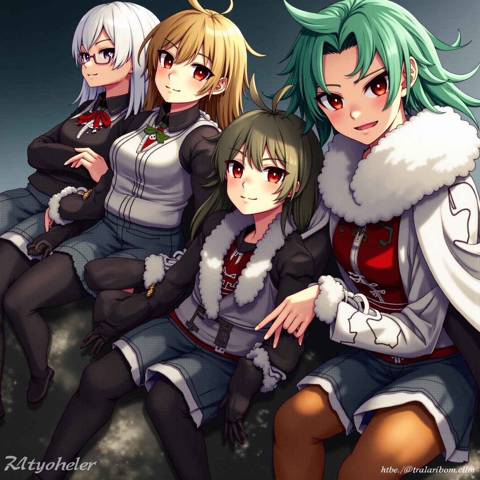
PROMPT: Photorealistic Conversion Use the uploaded image as a strict visual reference. Create a photographic, ultra-realistic portrait of a real human woman that matches the exact pose, head angle, facial orientation, framing, and composition of the reference image. The subject must be rendered as a real person photographed with a professional camera, not an illustration. Preserve exactly: Head tilt, gaze direction, and posture, Cropping, scale, and position in frame, Clothing design, armor structure, visor shape, and equipment layout, Hairstyle length, direction, and volume. Convert all elements to real-world materials: Skin with natural pores, fine wrinkles, subtle asymmetry, realistic subsurface scattering. Hair as individual strands with natural highlights. Optical eye piece as real optical material (tinted glass or polycarbonate) with believable reflections and thickness. Clothing and armor as real fabrics and composites (stitched seams, wear patterns, realistic stiffness) Lighting should resemble high-end studio portrait photography with soft but directional light, natural shadow falloff, realistic contrast, and accurate color response. Use a full-frame DSLR or cinema camera look, shallow depth of field, sharp focus on the face, natural lens perspective. The final result must look indistinguishable from a real photograph of a real person wearing real tactical/futuristic gear, while remaining perfectly faithful to the reference pose and design. NEGATIVE PROMPT:Do NOT stylize, cartoonize, illustrate, or beautify unrealistically. Avoid:CGI, 3D render look, game art, concept art, Anime, cyberpunk illustration style, painterly effects,Smooth plastic skin, waxy faces, airbrushed texture,Exaggerated facial symmetry or idealized proportions, Over-glow, neon lighting, rim-light outlines,Costume-like materials that look fake or foam-based, Changing the pose, camera angle, framing, or clothing design, Adding or removing accessories or armor details, No fantasy aesthetics. No illustration cues. No stylization. The image must read as a real photograph first, not a game character.

as a jungle explorer wearing adventure equipment, background is jungle

remove clothes

A black-and-white central-compositioned closeup photo at night. The silhouette of a man's legs stands with his back to the camera on railroad tracks, facing the background. A spotlight from the background shines between his legs. Someone's other far silhouette is in this spotlight. dramatic backlit lighting.

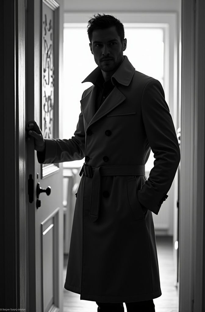
black-and-white photo with the broad-shouldered silhouette of a man in a trench coat standing in a doorway coming in. The man holding the door handle, as if he just entered the room.
FLUX.1 이미지 변환 생성기 사용 방법?
FLUX.1 이미지 변환을 사용하여 이미지를 변환 및 향상시키는 방법은 다음과 같습니다:
- PNG 또는 JPG 형식으로 최대 2048 x 2048 픽셀 크기의 이미지를 업로드합니다.
- 적용하려는 변경 사항이나 향상을 자세히 설명하는 텍스트 프롬프트를 입력합니다.
- 해상도 및 노이즈 제거 수준과 같은 모델 매개변수를 조정하여 원하는 결과를 얻습니다.
자주 묻는 질문
FLUX.1 이미지 변환은 무엇에 사용되나요?
FLUX.1 이미지 변환은 특정 텍스트 설명을 기반으로 이미지를 변환하고 향상시키는 데 사용됩니다. 사진 편집, 창의적인 프로토타이핑 및 아트워크 개선에 완벽합니다.
FLUX.1 이미지 변환은 어떻게 결과를 생성하나요?
FLUX.1 이미지 변환은 강력한 변환 모델을 사용하여 텍스트 프롬프트를 해석하고 업로드된 이미지에 상세한 수정을 적용하여 고품질의 출력을 생성합니다.
FLUX.1 이미지 변환에서 기대할 수 있는 이미지 품질은?
FLUX.1 이미지 변환은 최대 2048 x 2048 픽셀 해상도의 최고 품질의 이미지를 제공하며 매우 사실적이고 세밀한 비주얼을 제공합니다.
FLUX.1 이미지 변환은 상업적 용도로 적합한가요?
네, FLUX.1 이미지 변환은 개인, 과학 및 상업적 용도에 적합하며, 다양한 응용 프로그램을 위한 유연한 라이선스를 제공합니다.
FLUX.1 이미지 변환의 특별한 점은 무엇인가요?
FLUX.1 이미지 변환은 고급 AI 기능으로 사용자 프롬프트와 밀접하게 일치하는 정밀하고 세부적인 이미지 변환을 가능하게 합니다.
FLUX.1 이미지 변환에서 최고의 결과를 얻으려면 어떻게 해야 하나요?
최고의 결과를 얻으려면 명확하고 자세한 프롬프트를 사용하세요. 다양한 매개변수를 실험하여 필요에 맞게 출력을 조정하세요.