Генератор FLUX.1 Изображение в Изображение
Преобразуйте ваши изображения с помощью Генератора FLUX.1 Изображение в Изображение. Благодаря трансформатору с 12 миллиардами параметров, этот инструмент позволяет выполнять удивительные модификации и улучшения на основе детализированных текстовых подсказок.
Сгенерированное изображение

make a movie poster keeping the background as black. "Urfi ma'am" text should be written upon that keep the girl in between and make her look like an actress with a black sunglasses on her face.
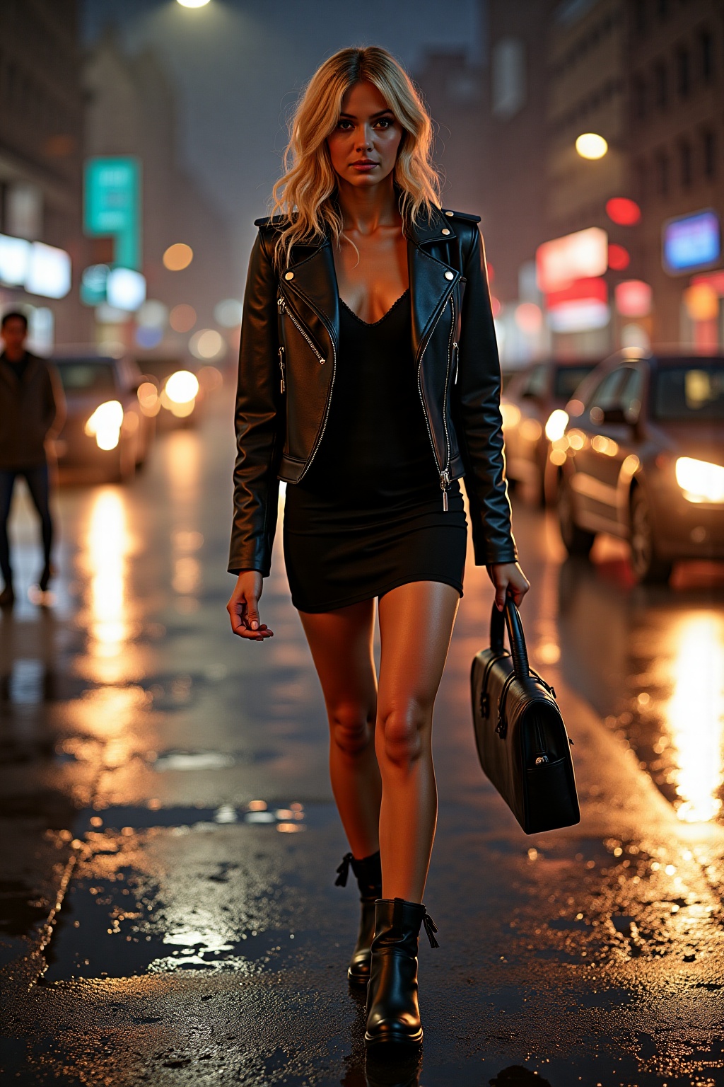
REFERENCE IMAGE DEFINES THE IDENTITY. Preserve exact facial identity from reference image: identical face shape, eyes, nose, lips, jawline, cheekbones, eyebrows, hairline, hair color, hairstyle. No makeup, natural skin texture, realistic pores, candid photo, photorealistic DSLR image. Identity lock: do not change face or create a different person. Young blonde woman walking on a rainy city street at night. Wearing a fitted black leather jacket and short dress underneath. Wet hair slightly messy, glowing street lights reflecting on wet pavement, confident sensual walk, mysterious expression. Cinematic noir style photography, ultra realistic, shallow depth of field, dramatic lighting. Full body shot.

A black and white photo of a man's head just above dark water, sunglasses partially submerged. The camera is low, parallel to the water
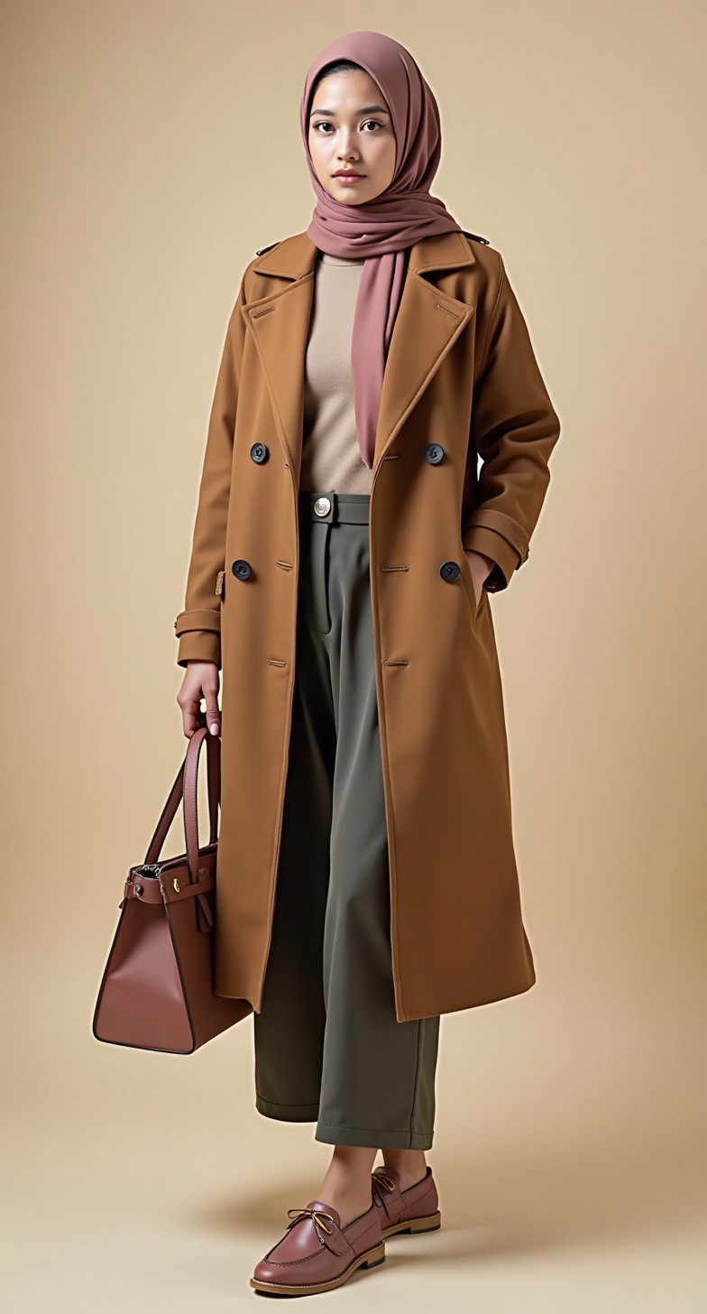
The large image is the product image to edit. The small images are reference images for the model face and studio environment only. Use the face from the reference image provided in the small images and apply it naturally to the model. It is mandatory to clearly replace the original model face with the reference face so the final result does not look like the original model. Also noticeably change the model pose, body posture, head angle, hand position, and overall stance in a natural elegant way while keeping the outfit exactly unchanged. Preserve the exact fabric, texture, material, and design details of the clothing without altering the type of fabric in any way. Extremely important: if the original large image shows only part of the model or outfit (for example upper body only, half body, or cropped view), keep exactly the same crop, framing, zoom level, and visible outfit area. Do not expand the image, do not generate a full body, and do not invent any hidden or missing clothing details outside the original visible area. Even when keeping the same crop/framing, you must still clearly change the model face, facial expression, pose, body posture, head angle, and hand position so the final result looks different from the original image. Only edit what is already visible in the original image. Clearly change all visible accessories, including hijab style, earrings, bag, shoes, jewelry, and styling details, so the final image looks visually different from the original photo while still preserving the same outfit. Create a realistic professional fashion catalog photo with a luxurious beige studio, soft lighting, matching the original framing/crop, modest fashion style, clean ecommerce look, one model only.
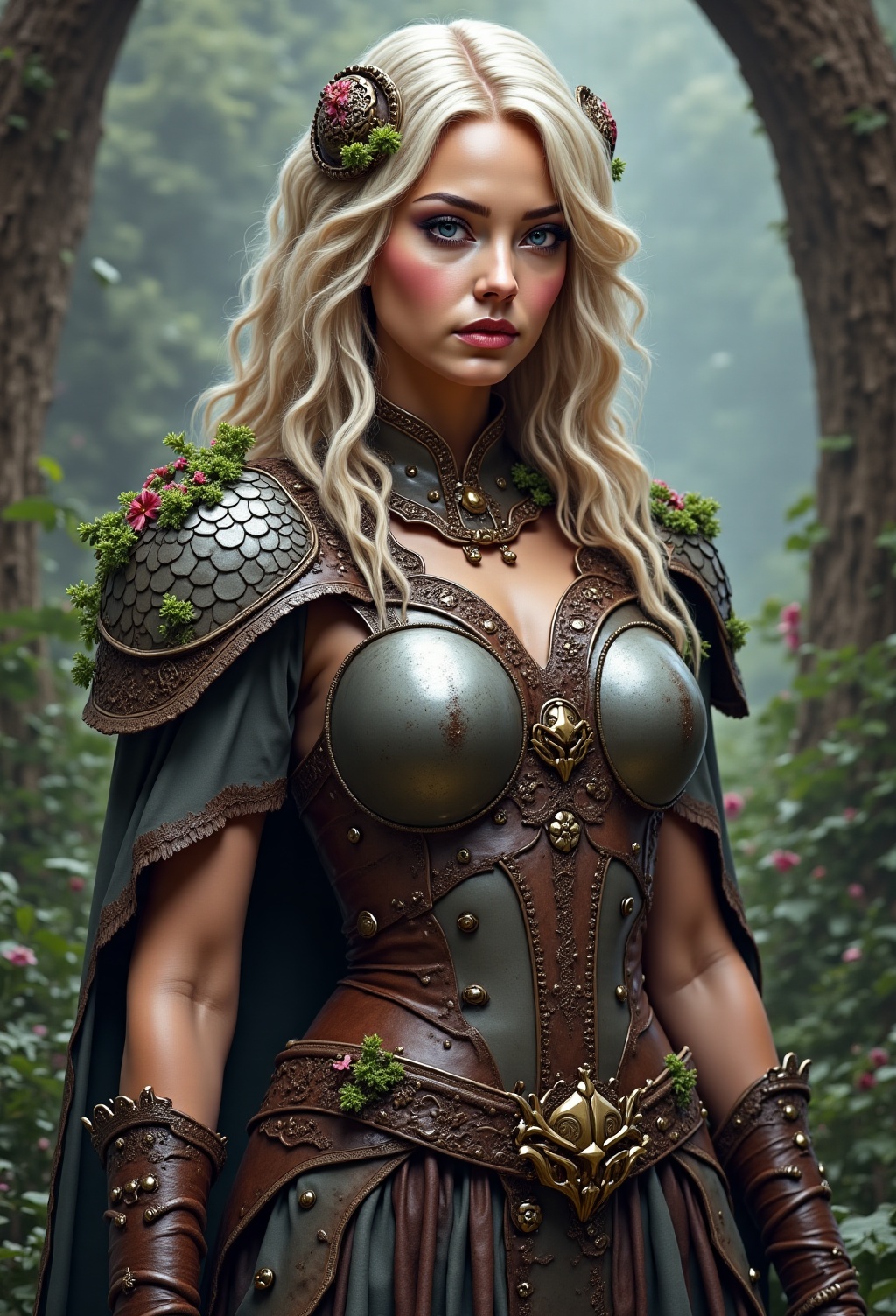
- remove the mushroom element on her bracers and instead put throny vines there - make hair length on left side of Pic same as right side -remove plants on metal pauldron, make pauldron leather instead

me on a desk on a computer

black forest gateau cake spelling out the words "FLUX DEV", tasty, food photography, dynamic shot

Has que esta imagen tenga los ojos color café

ultra realistic, highly detailed skin texture, 8k resolution, cinematic lighting, natural face, sharp focus, realistic colors, hyper detailed eyes, realistic hair, masterpiece, studio lighting, professional photography, shallow depth of field, realistic background, cinematic shot, dramatic lighting, realistic painting style, smooth realistic skin, natural anatomy, lifelike proportions, photorealistic rendering, maintain original composition and pose, smooth and detailed textures

Ultra realistic full body photo of the exact same woman from the reference image, standing under a modern walk-in shower, entire body visible from head to toe, wet hair, water droplets on skin, identical facial features to reference photo, accurate face preservation, natural body proportions, elegant pose, white marble bathroom, soft cinematic lighting, realistic skin texture, full-length composition, professional lifestyle photography, shallow depth of field, magazine-quality shot, highly detailed, photorealistic, 85mm lens, ultra realistic, high resolution, looking at camera, natural posture, luxury interior, authentic human anatomy

Как использовать Генератор FLUX.1 Изображение в Изображение?
Следуйте этим шагам, чтобы преобразовать и улучшить ваши изображения с помощью FLUX.1 Изображение в Изображение:
- Загрузите ваше изображение в формате PNG или JPG с разрешением до 2048 x 2048 пикселей.
- Введите детализированное текстовое описание изменений или улучшений, которые вы хотите применить.
- Настройте параметры модели, такие как разрешение и уровень удаления шума, для достижения желаемого результата.
Часто задаваемые вопросы
Для чего используется FLUX.1 Изображение в Изображение?
FLUX.1 Изображение в Изображение используется для преобразования и улучшения изображений на основе конкретных текстовых описаний. Это идеально подходит для редактирования фотографий, создания прототипов и совершенствования произведений искусства.
Как FLUX.1 Изображение в Изображение генерирует результаты?
FLUX.1 Изображение в Изображение использует мощную трансформаторную модель, которая интерпретирует ваши текстовые подсказки и применяет детализированные изменения к загруженному изображению, создавая высококачественные результаты.
Какое качество изображения я могу ожидать от FLUX.1 Изображение в Изображение?
FLUX.1 Изображение в Изображение обеспечивает высококачественные изображения с разрешением до 2048 x 2048 пикселей, предоставляя очень реалистичные и детализированные визуальные эффекты.
Подходит ли FLUX.1 Изображение в Изображение для коммерческого использования?
Да, FLUX.1 Изображение в Изображение подходит для личного, научного и коммерческого использования, предлагая гибкие лицензии для широкого спектра приложений.
Что делает FLUX.1 Изображение в Изображение особенным?
FLUX.1 Изображение в Изображение выделяется благодаря своим продвинутым возможностям ИИ, позволяя осуществлять точные и детализированные преобразования изображений, которые точно соответствуют пользовательским подсказкам.
Как я могу достичь наилучших результатов с FLUX.1 Изображение в Изображение?
Для достижения наилучших результатов используйте четкие и детализированные подсказки. Экспериментируйте с различными параметрами, чтобы уточнить результат в соответствии с вашими потребностями.
